First-timers didn’t know what to expect, which centre to pick or how to book.
What I did
Designed and built a responsive site around a first-visit guide, location comparison and a visit planner.
My role
UX/UI design & development
Status
School project with a simulated client. Live demo, not yet tested with users.
01 / THE BRIEF
Make the first visit feel easier to start.
The climbing centre wanted more first-time visitors to decide to come. Uncertainty before the first visit, booking, choosing a location and finding beginner information were the main problems.
How might the website give someone enough clarity and confidence to take the next step?
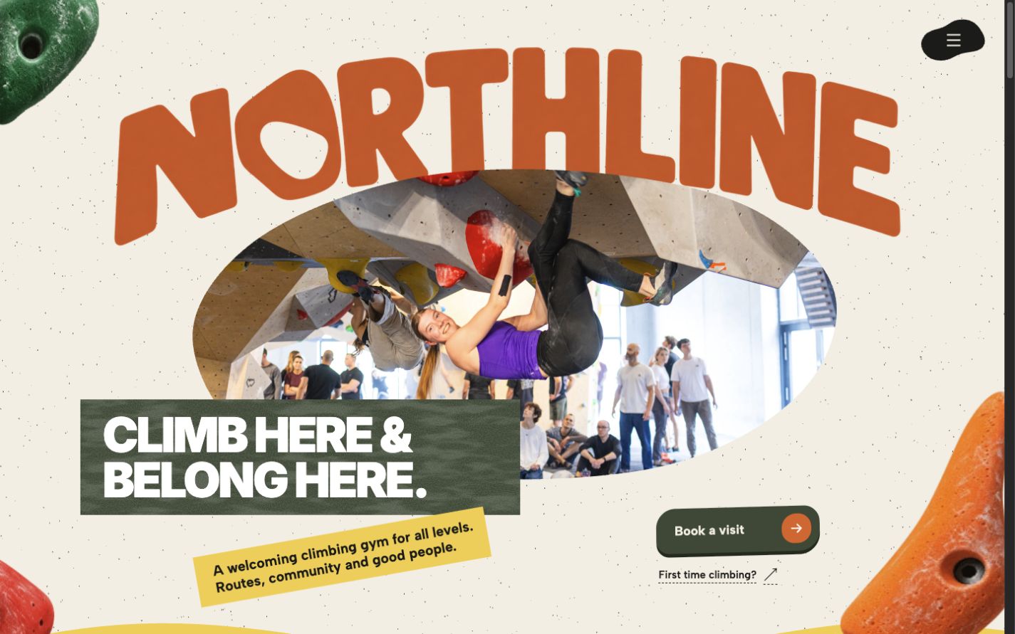
The brand had to feel warm and community-focused, and show that beginners belong here too.
02 / THE FIRST VISIT
“What do I need for my first climb?”
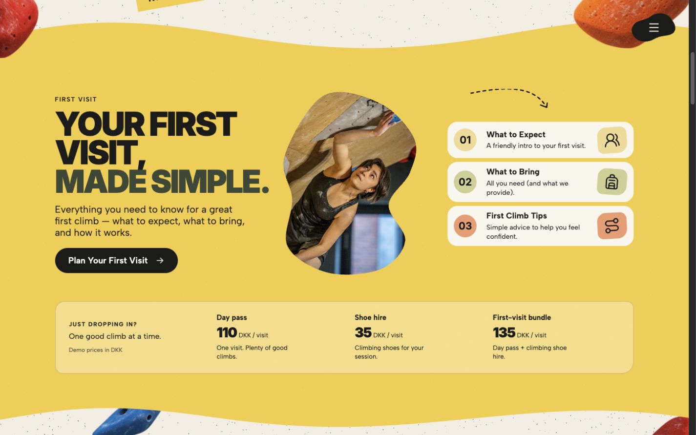
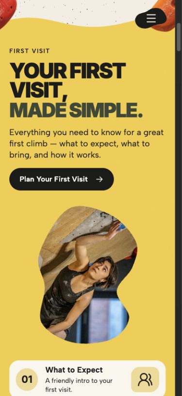
First-time visitors get their own starting point: what to expect, what to bring and first-climb tips together, with one clear action to plan the visit.
Route grades get names and short descriptions alongside the colours, so beginners know where to start.
Practical information and the next step in one place.
03 / FROM INTEREST TO A VISIT
Choose a location. Then plan the visit.
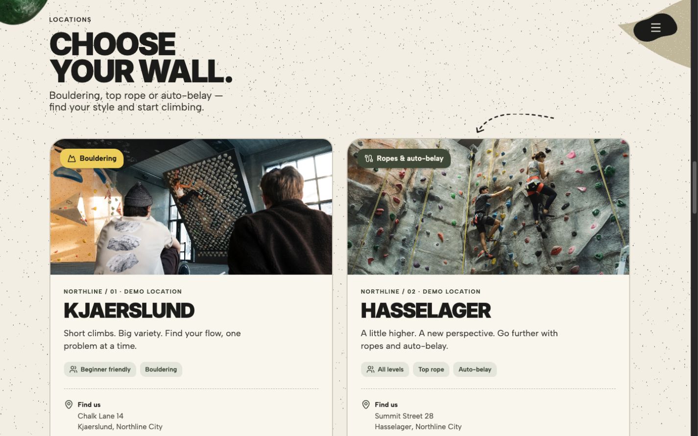
Location cards compare the climbing styles at each centre and lead straight into the visit planner.
Compare the centres by the climbing they offer.
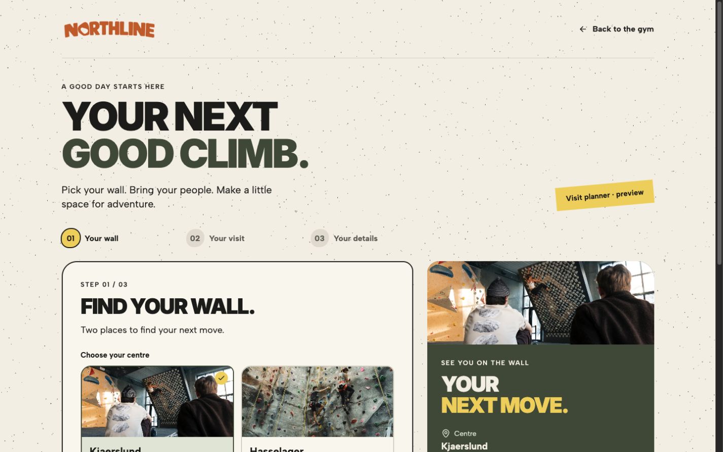
The planner carries the chosen centre through the visit and contact details. Progress steps and a summary keep every choice visible.
A front-end preview of the booking flow.
04 / THE VISUAL DIRECTION
Climb here. Belong here.
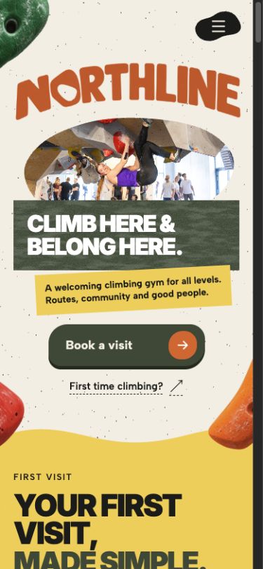
Warm orange and yellow, forest green, climbing-hold shapes and social photography carry the centre’s character. A community section sits beside the practical information, so the site introduces the people as well as the sport.
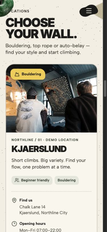
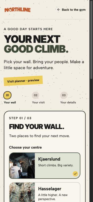
Responsive by design The layout reflows for mobile and keeps its character.
05 / WHAT’S NEXT
A working website, ready to test.
The live demo covers first-visit guidance, route information, location comparison, community content and the visit planner.
Next, I’d test it with first-time visitors, regular members and reception staff: can they find what they need and plan a visit on their own?